
Here’s a graph showing some guy’s position as he’s out for a walk:
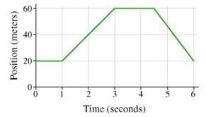
Take a moment and describe in your own words what he’s doing. If you said, “He went up a hill and down again,” I’m sorry, you’re incorrect. But don’t feel bad – that’s a common answer when you ask this kind of question in a first-year physics class.
Andrew Elby calls it WYSIWYG graph interpretation. Robert Beichner investigates these particular “kinematic graphs” that show distance, velocity and acceleration versus time while this terrific paper by Priti Shah and James Hoeffner reviews this graph-as-cartoon misconception and many others, with implications for instruction.
Almost every instructor in a science, technology, engineering or math (STEM) field, and many in the Humanities, too, lament their students’ inability to “use graphs”. I sympathize with them. But also with their students: graph interpretation is one of those areas, I believe, where expert-blindness, also called unconscious competence by Sprague and Stewart (2000), is most visible: experts don’t even realize what they’re doing anymore. By the time they’re standing at the front of the classroom, instructors may have looked at hundreds, even thousands, of graphs. We look at a graph and BAM! we see it’s key idea. I don’t even know how I know. I just…do.
Well, because of the line of work I’m in, I’m forcing myself to slow down and try to reconstruct what’s going on in my head. Task analysis, they call it. When did I read the axis labels? When did I notice their range and scaling? Was that before or after I’d read the title and (especially in a journal) the caption? When you finally get to looking at the data, how do you recognize the key feature – an outlier, the slope of the line, the difference between 2 bars of a histogram – that support the claim?
The ease with which we interpret graphs makes it difficult for us to teach it:
What do you mean it’s a guy going up a hill and down again?! Obviously he’s standing still for the first second – slope equals zero! D’uh!
I’ve been wrestling with this problem for a while. Every time it comes up, like it did this week, I dig out a piece I wrote in 2010 when I was part of the Carl Wieman Science Education Initiative (CWSEI) at the University of British Columbia. It was for an internal website so the version reproduced has been updated and some names have been removed.
Interpreting and Creating Graphs
I was at a 3-day meeting called Applying Cognitive Psychology to University Science Education which brought together science education researchers from the CWSEI in Vancouver and CU-SEI in Boulder and the Applying Cognitive Psychology to Enhance Educational Practice (ACPEEP) Consortium (or “star-studded” consortium, as CU-Boulder’s Stephanie Chasteen describes it.)
The skill of interpreting graphs came up a number of times. On the last day of the meeting, a group of us sat down to think about what it means to use a graph. One of us brought up the “up a hill and down again” interpretation of graphs in physics. An oceanographer in the group said she’d like to be able to give her students a complex graph like this one and ask them to tell her what’s going on:


We see the information flowing inwards to create a graph and information flowing outwards to interpret a graph.
Creating a graph
Students should be able to use words and stories, mathematical models and equations, and numbers/data to create a graph. All of this information should be used to select the graph type – time series, histogram, scatter plot, y vs x, etc. – based on what we want to use the graph for, the type of data and what best tells the story we want to tell. Once selected, a useful graph should have
- axes (for given variables, for combinations of variables that produce linear relations) with scale, range, labels
- uncertainty, if applicable
- visible and accurate data
- title, legend if necessary
- for graphs of functions, in particular, the graph includes (and is built from) characteristics of the function like asymptotes, intercepts, extreme points, inflection points
An instructor could assess a student’s graph with a graphing rubric with criteria like
- Does the graph have appropriate axes?
- Are the data accurately plotted?
- Does the graph match the characteristics of the function f(x)?
- and so on
The paper by Priti Shah and James Hoeffner reviews research into what people see when they look at a graph. It provides evidence for what does (and doesn’t) work. For example, if a graph shows the amount of some quantity, the amount should be the vertical axis because people see that as the height of the stack. On the other hand, if the graph is about distance traveled, distance should be the horizontal axis because that’s how people travel. One of my favourite snippets from Shah and Hoeffner: “When two discrete data points are plotted in a line graph, viewers sometimes describe the data as continuous. For example, a graph reader may interpret a line that connects two data points representing male and female height as saying, ‘The more male a person is, the taller he/she is’.” (p. 52) Their finding, as they say, have “implications for instruction.”
Interpreting a graph
More often in our Science classes, we give students a graph and ask them to interpret it. This is a critical step in figuring out and describing the underlying (that is, responsible) process. Just what is it we want students to do with a graph?
describe Describe in words what the graph is showing:
Given two distance vs time graphs, which person is walking faster?
What is happening here?
How have the CO2 levels changed over the last 400 000 years? [And we’ll save “why has it been doing that?” for the next question.]
interpolate and predict Use the mathematical model or equation to extract values not explicitly in the data:
Give the graph of a linear function and ask for the expected value of another (the next) measurement.
Give the graph, ask for the function y=f(x)
Find the slope of the graph
read off data Extract numbers already present in the data:
What is the value of y for a given x?
In what years did the CO2 levels reach 280 ppmv?
When is the man farthest from the starting point?
Join the discussion
I’m always looking to collect examples of graphs—the ones students in your discipline have trouble with. It’s very likely we’re having similar issues. Perhaps these issues could someday be addressed with a graphing concept inventory test that expand’s on Beichner’s Test of Understanding Graphs in Kinematics (TUG-K).
[Update: Just prior to publishing this piece, I looked more closely at the “guy out for a walk” graph. He travels 40 m in 2 seconds – that’s 20 metres per second or 20 x 3600 = 72 000 m per hour. Seventy-two km/h? He’s definitely not walking. Perhaps I should have said, “Here’s a graph showing some guy out for a drive.” I’ll stick with the original, though. Yeah, maybe I did it on purpose, just to make you put up your hand and explain your answer…]
References
- Elby, A. (2000). What students’ learning of representations tells us about constructivism. Journal of Mathematical Behavior 19, 4, 481-502.
- Beichner, R.J. (1994). Testing student interpretation of kinematics graphs. Am. J. Phys. 62, 8, 750-762.
- Shah, P. & Hoeffner, J. (2002). Review of Graph Comprehension Research: Implications for Instruction. Educational Psychology Review 14, 1, 47-69.
- Sprague, J., Stuart, D. & Bodery, D. (2013). The Speaker’s Handbook (10/e). Boston: Wadsworth, Cengage Learning.
Thanks for the thoughtful post, Peter.
I teach in an IB Middle Years Programme and Diploma Programme school in Japan, and as a department this year we have been looking at the MYP sciences criterion on processing data: aiming to look into student difficulties and set better resources, practices and vertical moderation so that we can help students better work with numbers and graphs. We will use our work from this year to try to measure improvement in criterion scores for next year, as our department goal.
I will share this with my colleagues – the diagram would make a useful poster/ reminder.
Thank-you,
Stephen (@IBiologyStephen)
Great post – thanks. I teach 10 year olds maths in the UK and many of these problems arise. The expert blindness thing is a constant worry!
It’s a lighter aside, but one thing I have done to get them playing with graphs as stories is do re-runs of this
http://www.amazon.co.uk/Pop-Charts-Paul-Copperwaite/dp/1844036642/
Getting them to turn a story into graphs/diagrams seems to be quite powerful.
I like your idea of using familiar things, like music, to spark a graph. I think students get very little practice at the very first step, deciding what kind of graph to make. We always tell them, “Make a pie chart showing…” or “Make a histogram…” or “Graph the function f(x) on these axes…” Deciding on the type of graph is something experts learn to do, and it’s a place where our blindness comes in.